Advice For Your Startup – Web Site Design
Now, that I’ve visited about 400 search engines and about 100 web apps, let me offer some tidbits of advice for your web startup page & site:
a) It’s 2007. Make sure all your copyright, trademark notices all read 2007.
b) Typos. SPELL CHECK. There was a site with about 25 words on its front page, one was spelled incorrectly.
c) It’s fine to use FLASH on your front page but ask people POLITELY to turn on Flash or to ask POLITELY to download a newer version BUT do not just make it an advertisement for Flash.
Do NOT do what the people at GLIDE have done – present a white page with some words demanding people to download FLASH before they can do anything else. Is that really the point you want to convey to people stopping by your “storefront?” That you are a shill for Adobe’s Flash? Now, if you are part of the Adobe family, that’s perfectly fine or if Adobe is paying you to put up a velvet rope in front of your potential customers – great but why would you go out of your way to block potential customers? You work so hard to get people to your site, don’t follow GLIDE’s example, just telling you to go away unless you do EXACTLY as they say?
Other than a logo and quotes about how great they are, this is essentially all you see at GLIDE (text quotes appear in middle of page – not in screenshot):
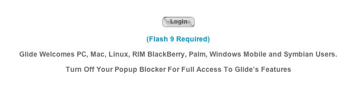
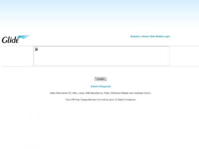
Now, if you’re a well establish company or you don’t want casual people to drop in – maybe, but why would waste an opportunity to brand? Not a photo, illustration or a mission statement? Nothing? … But just a demand and some quotes? What do we know about this company other than they really, really like Adobe Flash? Not much.
And frankly, are you enticed to explore further? I’m not.
So make sure if you are using Flash as your front gate, what does your site look like with Flash turned off or if the potential customer hasn’t upgraded, do you want to turn them away as unworthy?
d) Unless it’s obvious in your name “JOHN’S BAKERY” or “ALISON’S TIRES,” it’s best to put an explanation of what you do right there on the front page.
You don’t have to be fancy or get carried away – At JOTLET, this is right on the front page:
“Jotlet Calendar is an online calendar that helps students, families, and small groups manage and share their schedules online. It’s a perfect way to manage and share your schedule with family and friends.”
THANK YOU!
Nothing fancy, no mushy marketing speak – simply, here is what we can do to make your life easier.
Or from BaseCamp – they manage to cover a lot of ground and throw in some marketing but you know exactly what they stand for and how they might make your life easier:
“Why Basecamp?
Basecamp takes a fresh, novel approach to project collaboration. Projects don’t fail from a lack of charts, graphs, stats, or reports, they fail from a lack of clear communication. Basecamp solves this problem by providing tools tailored to improve the communication between people working together on a project.”
And then below, they offer more detailed examples.
Of course, it depends on how complex or how simple your offerings are …
Personally, I thought this was a little ‘stiff’ and too jargon sounding from SlideAware …
“SlideAware is a presentation management platform designed to help you & your team to manage the entire lifecycle of PowerPoint ™ presentations.”
Huh?
It turns out by “lifecycle,” they mean from blank page to final – not sure why they decided to muddle the waters. Even if it’s something that’s commonplace jargon for PowerPoint slingers, if your intention is to draw in new users, you don’t want to scare them if they’re not ready for a PowerPoint “lifecycle” – lifecycle – which could mean furious peddling that gets you nowhere or this presentation will follow you forever until you die … either way, not real pleasant.
From another site, try to talk like a human (being):
“… augmenting your team with the best of breed technology and a savvy strategic team who knows how to use it to your greatest advantage.”
Yes, I know you’re proud and you can augment and breed at the same time but we don’t want to hear about it. Let’s not cloud the issue – if you’re the best, just say so.
“We’re the best, we will help you kick ass”
(and take names because we’re also a business card scanner)
Okay, having the word ‘ass’ in your mission statement or your branding statement is probably not the most ideal but you get my point 🙂
e) Try not to use stock-art people on your front page. We are all so media savvy that we can tell right away this woman is thinking about getting a mortgage at 7%, deciding which fertilizer is best for her summer lawn and pondering dinner plans now that her man is taking the blue pill …

Or maybe she really, really, really like your accounting software package … if you know what I mean …
When your stock photo can mean everything from “I think I’m irregular – how can I be sure?” to “Will Hamburger Helper really stretch my household budget?” to “We’re accounting so you don’t to!”
You need to stop.
If you’re a shoestring operation, just skip photos. If photos are really important to tell your story, hire a local photographer and local actors for a few thousand dollars. At web resolution, you don’t need amazing, you just need a solid professional. Or check on OnRequest.
Or this from the same website:

Really? There was nothing else on the stock photo CD disc for $249? A photo of a guy who just backed in a broom or he’s the VP of East Coast Sales and you just accused him of using 45% of the company’s bandwidth on downloading torrents from NakedNakedMen.com?
Come on, think people.
Or Spinvox – great service – why is there a death-mask photo on your front page? They convert speech to email – do we really an indication where the mouth is on a human face? Really?
e) Even if you’re not crazy about the whole Web 2.0 look & feel, it is better than sticking with the Windows ’98 look. even if you are cutting edge technology wise, people will not be able to see past the Win ’98 look.
f) Help out people who want to review you. Put your logo in JPEG form on your ABOUT US page – and even better, take some tiny screensnaps of your website so we can drop them in our review. Help us help you.
g) Related to the Flash issue, it’s 2007 now and people are using everything from Linux to the Wii to a phone to surf your site so try think of it as a real storefront – how inviting are you? Are you excluding users? In essence, building a 4-foot doorway so anyone taller will have to make an effort to enter? If you want people to activate java or flash – ASK THEM POLITELY. Do not demand or imply they are morons – THEY/WE are your potential customers – do not alienate them/us in 10 seconds – your website front page is EXACTLY the same as the door to your brick & mortar business. We don’t as much of the must-use IE thing anymore but don’t design like that or let the designer you hire lazy out that way and drive away customers.
Speaking of storefront, take a look at the Tommy Bahama site. I think it’s safe to say that most people think of them as a apparel company and you would want to go their site to look at the clothes – so why is there a HUGE log-in the middle of the front page? Sure, I understand they would want to create some sort of club where “members” might have privileges, etc, that’s all fine but why so large – why make it seem as if you have to log in to check out the rest of the site. Now, you don’t have to – but then why create that impression? Why push your apparel line, your MAIN business to the top in small thumbnails while the log-in dominates the page? Who is a bigger base? Your members or people interested in your clothes? I find it hard to believe that they would have 200 million club members – isn’t it the other way around? Don’t you want to reach 200 million people and oh, by the way, you can also join our club with these benefits? Or look at it this way, MySpace has 170 MILLION accounts and the log in is less prominent than Tommy Bahamas.
Let’s think through every impression you make. When your site draws, what do customers see and why?
h) Do NOT auto play anything on your website with audio. Yes, in 1999, that was clever but not now – ANYONE can do it – that does not mean you should. And yes, even if you are a musician or a music site, do NOT presume anything. Offer or ask us POLITELY. How easy is it to get someone to surf to your site? Now, that they have actually arrived, you want to assault their aural senses because that will win them over? Really?
Next time you are out window shopping on the street, if you stop to look at my storefront, I should have someone drop from nowhere and hold a boombox next to your ear at 110 decibel? Hey, you stopped to look, you should listen to my favorite song! Right?
THAT IS WHAT YOU ARE DOING with AUTOPLAY on the web.
It serves NO purpose – why? Because for every one person who might like it, there are 10 others who are annoyed and forced to look for the mute button – so why risk that? Isn’t it hard enough to get people to your site? Why would you want their FIRST interaction with your website to look for a mute button?
i) Answer your emails. And do not then send an automated email asking people to call you even if it’s an 800 number. If they wanted to talk to you on the phone, they can pick up the phone. If people send you an email, respond by email.
j) Test out every link on EVERY page with more than one browser and more than one OS. There are so many sloppy sites out there where if you ask people to fill in information but if they miss something like the state, it erases everything (not customer friendly) or the worst if you enter some “bad info,” it triggers a text error line from your DB. So, test out ALL your forms by typing in numbers where text should go and text where numbers should go and see what happens.
“config/config.class.php(103): ConfigDbStorage->ConfigDbStorage(NULL) #2 /home//www/post(12): Config::getConfig() #3 {main} thrown in /home//www/class/database/db.class.php on line 42” is NOT something customers should see.
Related to that is you have to understand where most of your customers are or coming from … so if you have a country pulldown and you’re going to do 99% of your business here in the US or Canada, do NOT list in alpha order – as much as want to support the rebirth of Afghanistan, how many orders are you getting from there? Let’s list the US & Canada FIRST and then draw a line and alpha the rest. Now, of course, if you are doing business on an even basis across the globe, great – then by all means – alpha the list but otherwise, look at EVERY detail.
k) Make sure your pages are named correctly, when I want to bookmark your site, I don’t want to see MOZILLA FIREFOX or DREAMWEAVER as the text in the box so that I have to type over … also and I know you want SEO but let’s not get too carried away – there should be no more than 10 words in my save bookmark text box.