
Mattel Disney Pixar CARS 2 Diecast: Finn Logo Variants & Errors
After 20 months, we still don’t really what is the correct M logo that Finn McMissile has on his hood & trunk.
Because after a while, we just stopped looking at Finn so it’s hard to really tell when they began the switchout – if there was a plan, if it was simply poorly produced or whether it was intended to create variants to “collect ’em all,” it’s hard to tell at this point.
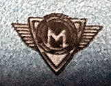
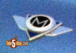
One of the early produced Finn’s featured this blue logo.
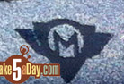
They then realized it should be black.
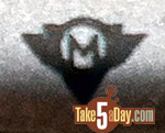
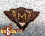
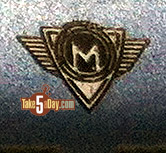
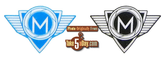
These two are obviously different from the next series with hardly any detailing. So, at some point, someone at Disney or Pixar decided to go back to the Adobe illustrator drawing board and re-do it … so the most often featured logo is this one. Presumably this is the new “official” standard:
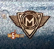
Though there might’ve been a transition one where they attempted to get closer to the actual logo. Or it could just be over-inked and/or improperly prepped.
But again during this period, “this final” one appeared more often …
There were also botched versions – either poor printing or poor application so it might’ve seemed like there were other variants but my feeling is they are just botched error ones. One reason for this is Mattel had at least three plants cranking away on Finn McMissiles. Within these, there were also some releases with a “final” logo on the front but one of these mis-shapened ones on the back or in some bizarre cases, the “final” logo on the front but the blue or black in the trunk.
And in the perfect twist for Finn McMissile, apparently NONE of these are the actual correct ones.
This is from MEET THE CARS but all the other books with Finn features this logo.
Wings on the side (probably too low res to see the grid lines), a blue or black triangle with a silver border and a white M on a black background with another silver border.
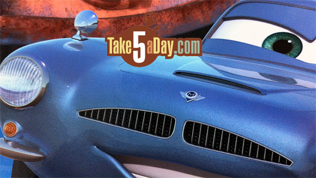
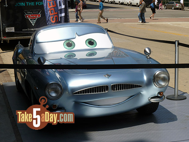
Even the one on the 3D mock Finn McMissile (sent on the State Farm Tour) features a logo the doesn’t really settle any issues – thanks for the nice photos, Tom D.
![]()
It looks like the “final” logo except that the M triangle layer appears to be teal – which vaguely matches the color of Finn McMissile but really Finn is more “Carolina Blue” … so we don’t know if the inside color of the triangle is supposed to match whatever surface it sits on or if it’s supposed to be blue in some manner. The book images don’t help as they look dark blue.
The backside logo on this “real” Finn is the same as the front.
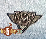
Below is the logo from the Ridermakerz sticker collection so this is probably the actual official OFFICIAL correct logo. It is complicated but NOT that complicated.![]()
So, the final verdict – we have 3 or 4 Finn McMissile logos on the diecasts with another set of error/poor versions BUT at the end of the day, they are ALL INCORRECT.
The current most commonly used one (and the current version) is mostly correct …
But the triangle layer should have a black background and instead of black bars circling the M portion, it should have a camera shutter look or a tribute to the “propellers” motif within like the BMW logo.
GotFrank sends a fortune cookie note which seems entirely appropriate for this car where no one from Mattel, Pixar, Disney, illustrators, diecast makers, replica car makers, licensors and manufacturers all have no idea what his logo should actually be …
“You appeal to a small select group of confused individuals.”
I think that pretty much sums it up perfectly.
Don’t collect them all.
| « Mimobot Answers Your Star Wars Wish – A Jar Jar Binks Memory Stick | Blacksparrow Auctions: Old Toys Worth Some Money » |


Excellent documenting Met!.
The D23 Finn Dark blue Ransburg Finn’s logo is not quite as good the last photo you show. the “camera shutter” design around the M is very indistinct.
Pretty sure I have plenty of each,it could not be avoided. I was lucky to trade for 2 unibody Finn on Porto Corsa card which is quite hard to get. Then a few weeks ago a German Collector couldn’t find one for his collection, I sent him one of the unibody Finns which originally came from Spain. World traveling Finn.
Great write up, as always… I know other than to count the number of Finns on pegs, I quit looking at Finn until the London Rescue 12 pack with a unibody Finn came out – I made sure to purchase the 12 pack with the unibody… And then I looked at the Security Finn unibody single from case D and bought it… I thought I was done with Finn until case F came out – and I’ve bought both unibody and 2 piece versions on the 2013 cardback… Still, my favorite Finn is the blue metallic paint version that’s appeared as part of the D23, Walmart Blu-Ray combo pack, and most recently UK TRU single… and as far as which logo(s) I have on my Finns, I don’t know and I’ll keep it that way.
“we just stopped looking at Finn” — LOL!